
THE CLIENT
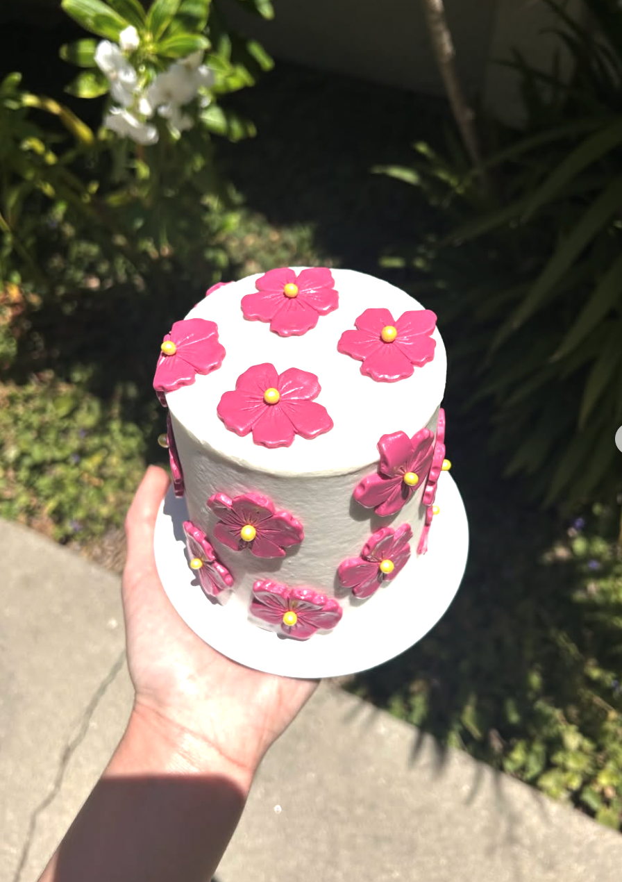
Sweet Rayne Bakehouse is a newly created bakery business based out of Santa Barbara, CA. They specialized in custom cakes, as well as individual treat drops such as cookies, cupcakes, and more.
THE JOB
The client had a strong aesthetic in mind for their business with several requests. They were particularly interested in a pink and yellow pastel palette matched with retro coffee shop graphics and logos that feel very comforting and familiar. They also wanted to utilized scripts, stripes, and build on the late 60s, early 70s look
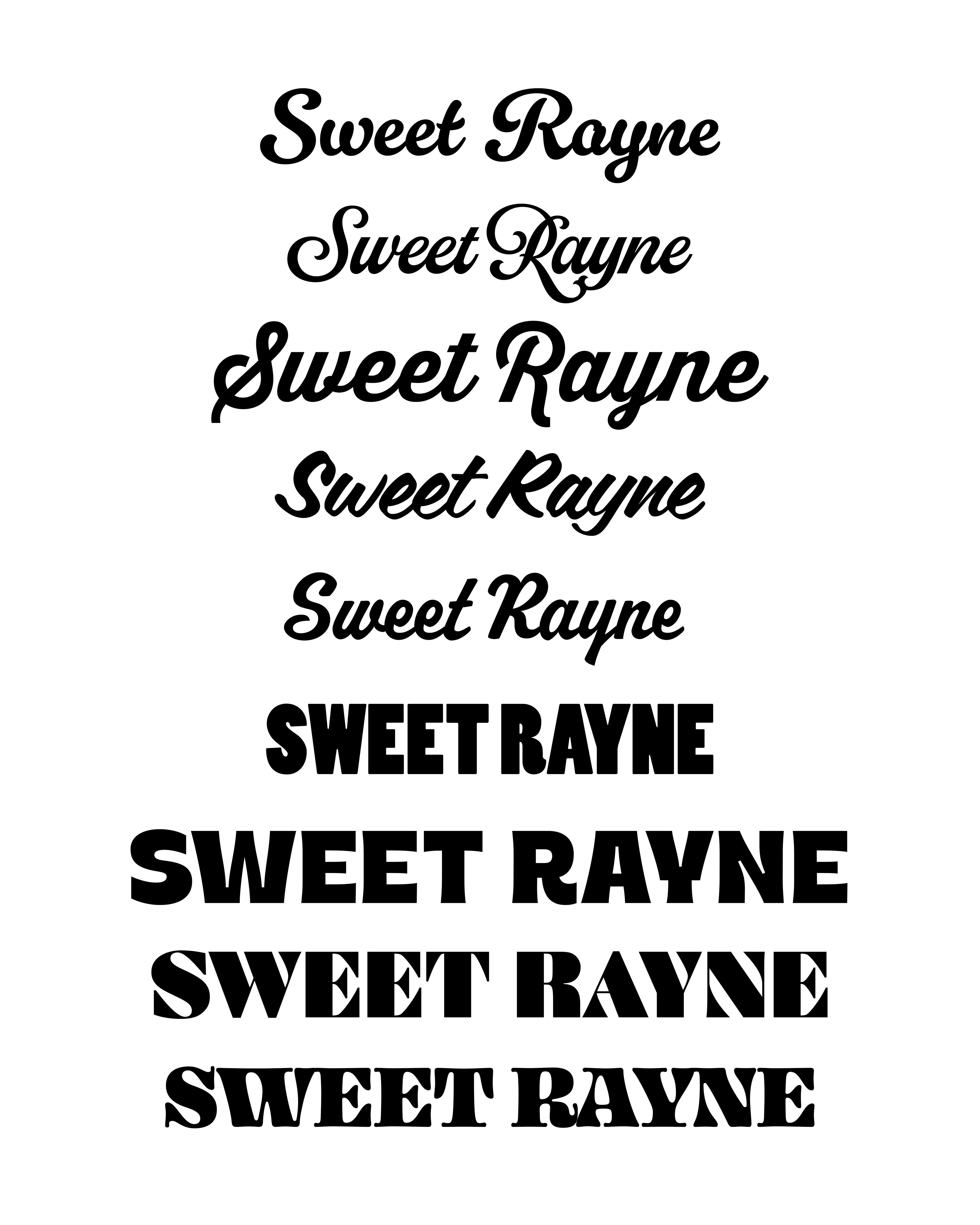
First Drafts of Type
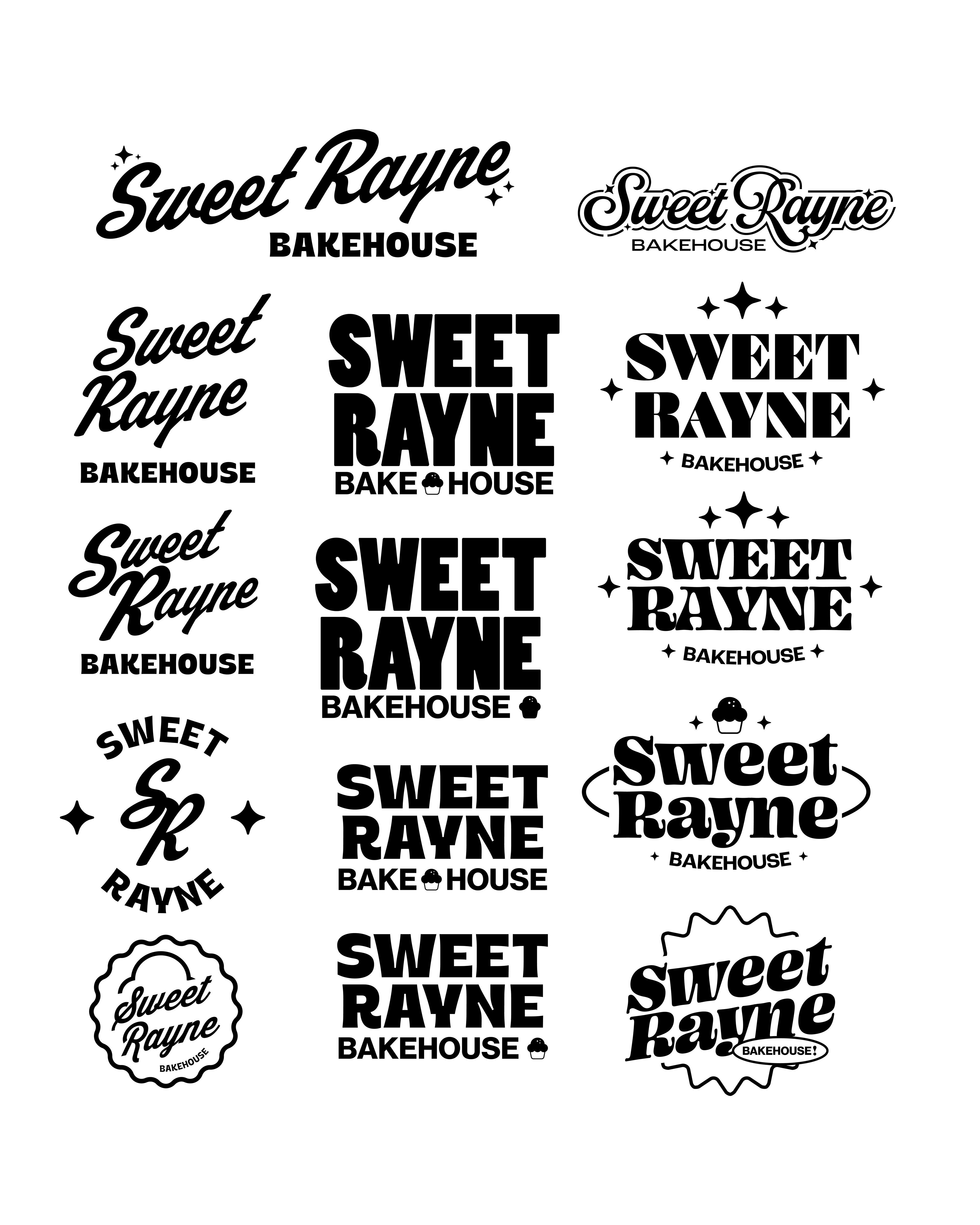
First Drafts of Logo
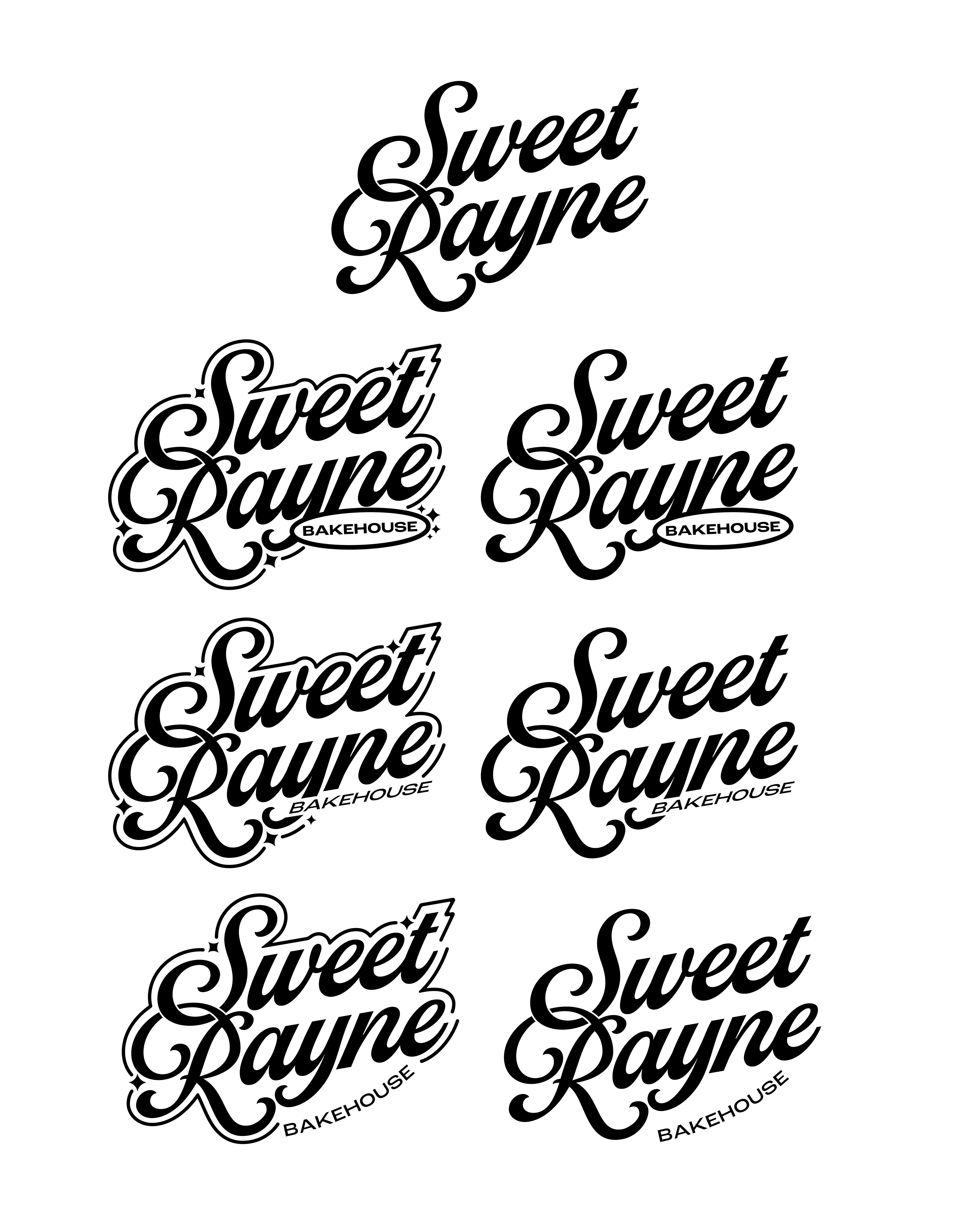
Secondary Drafts of Logo
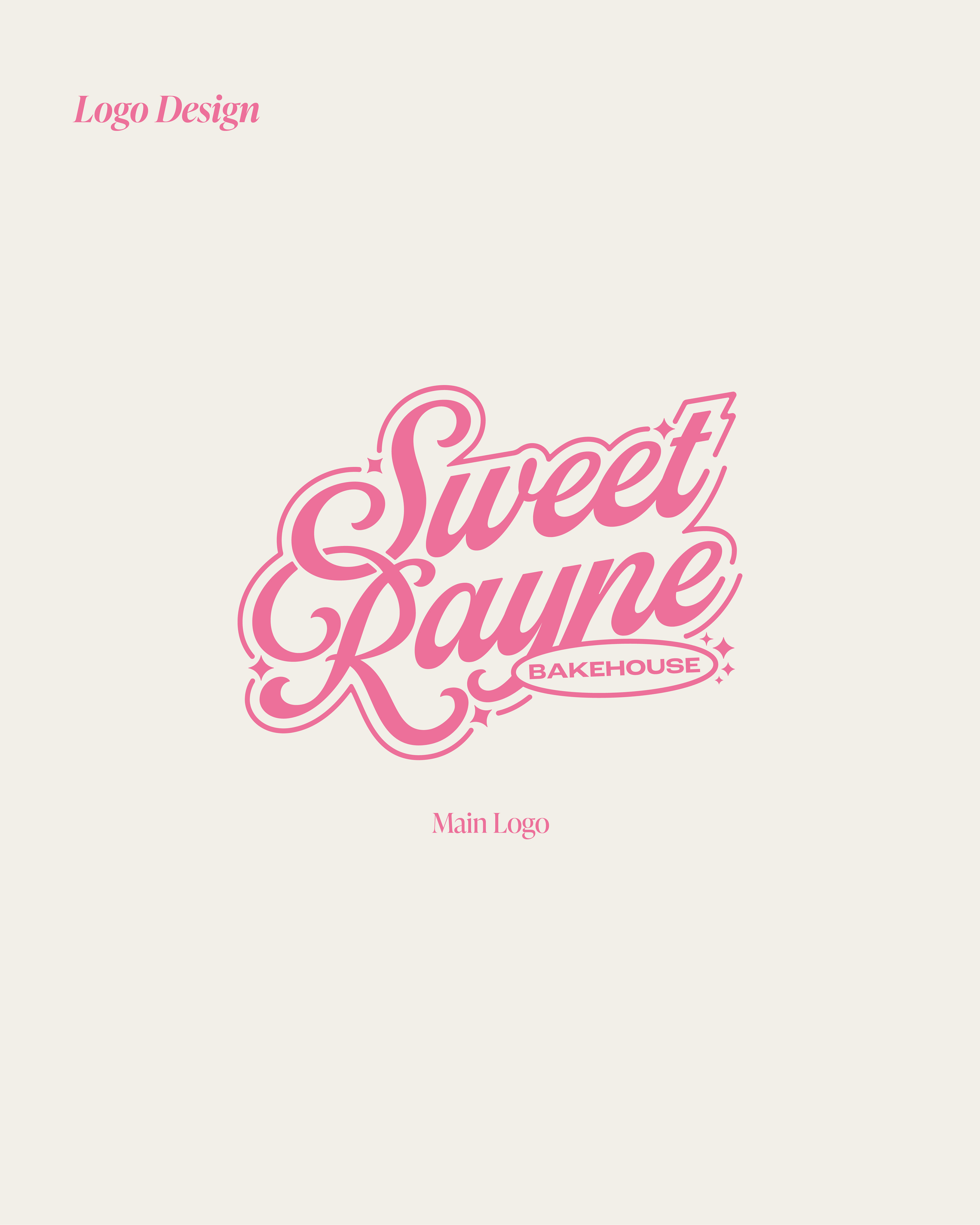
MAIN LOGO
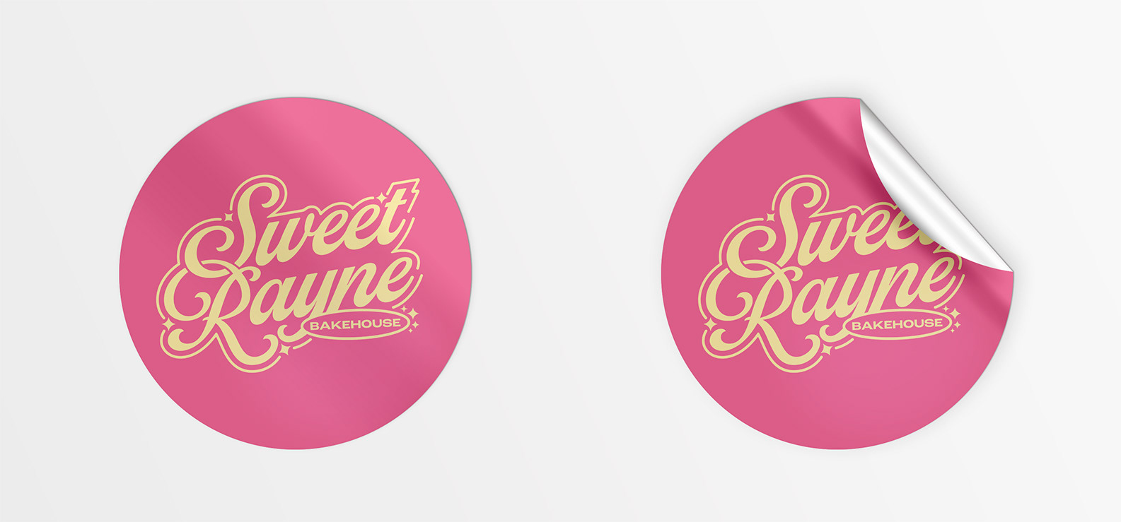
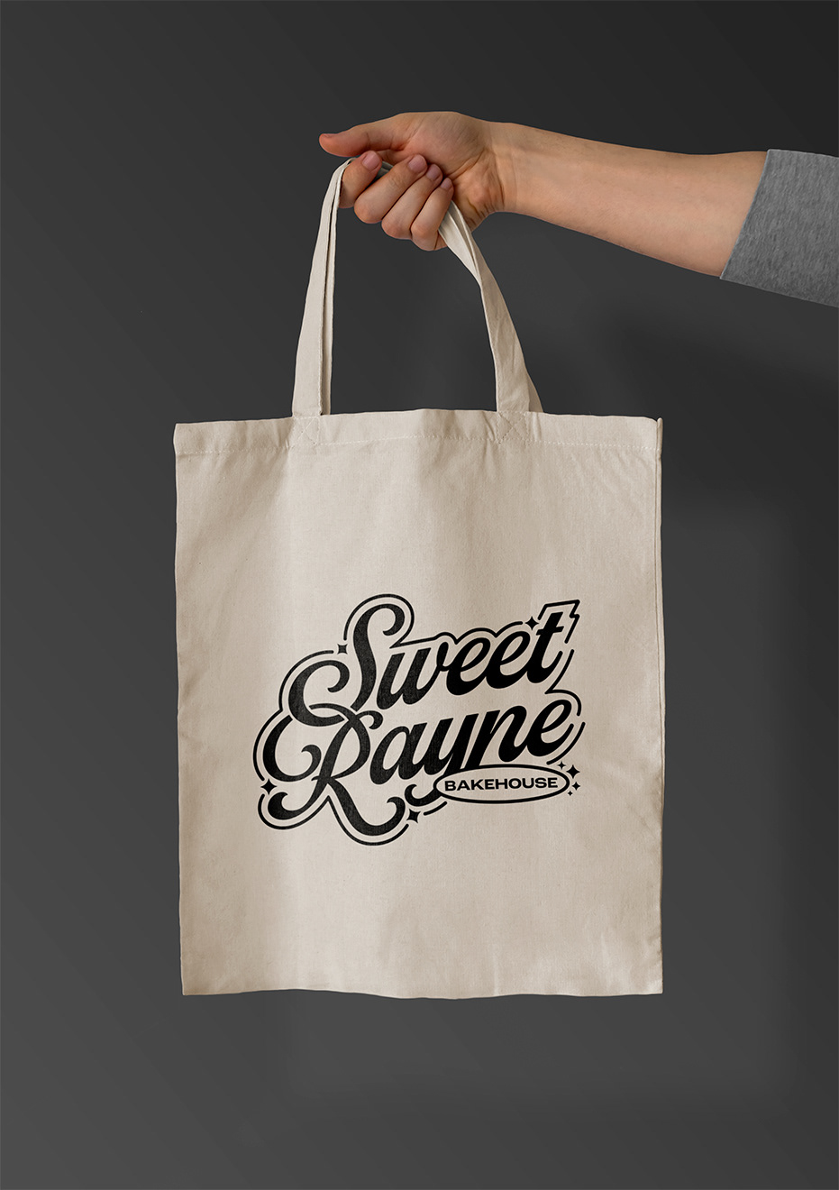
The primary logo features a stacked script surrounded by stars and sparkles that exude the brands key identity.
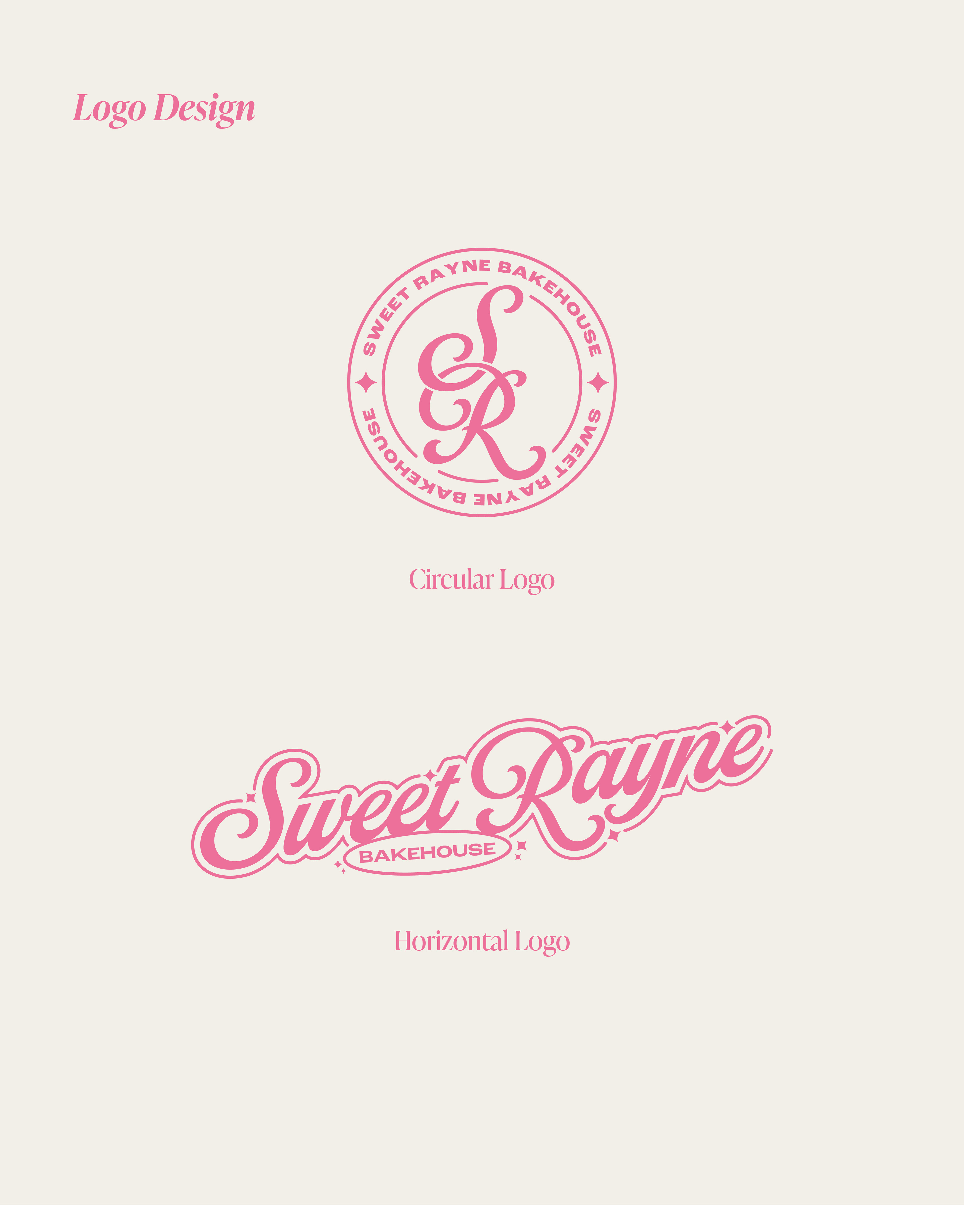
SECONDARY LOGOS
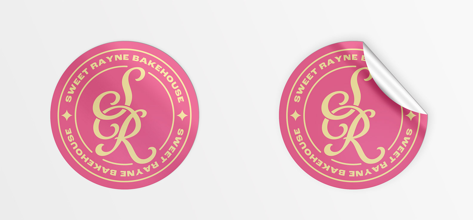
This same effect is added onto the horizontal lockup for different uses. Also, an included circular seal initial lockup
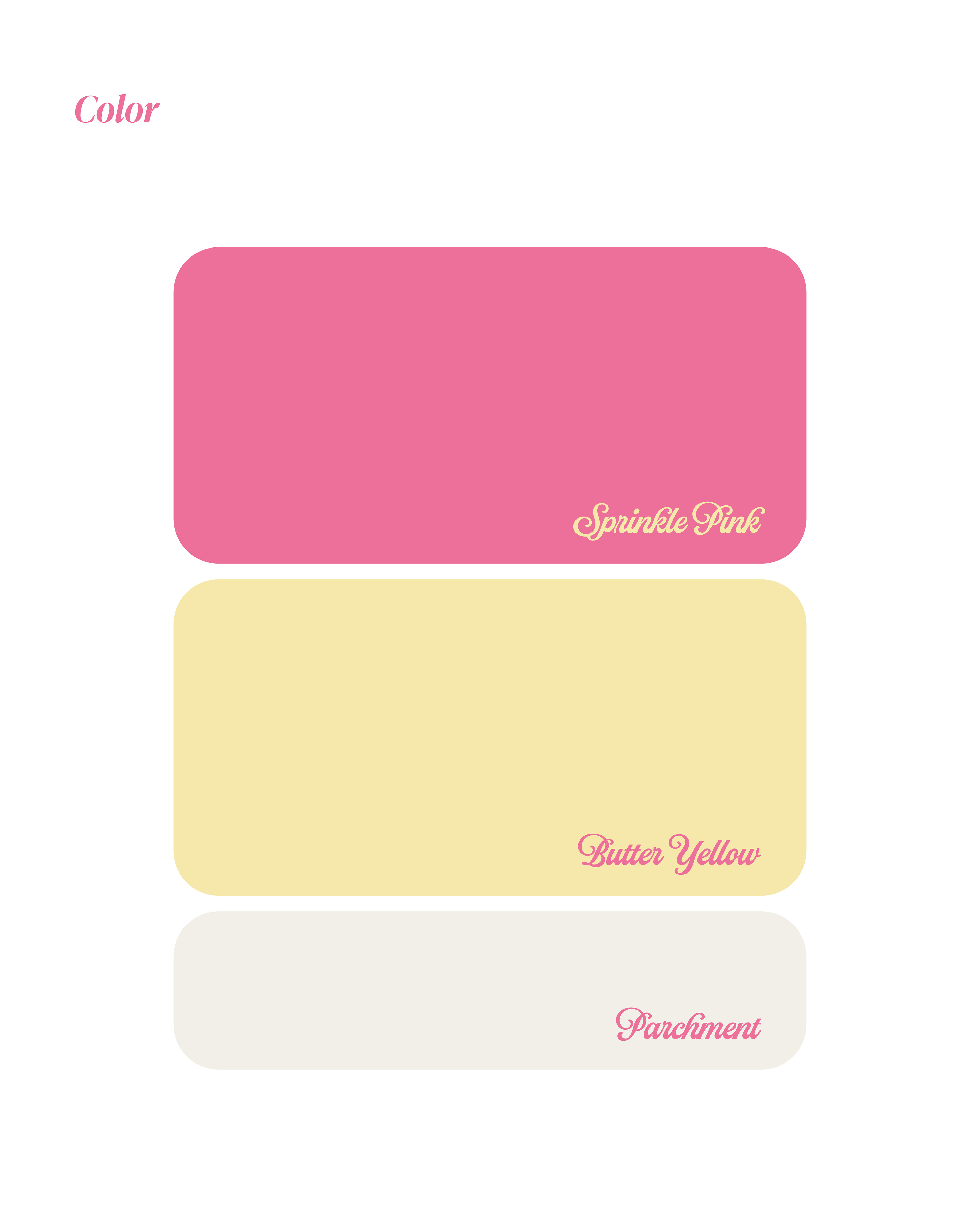
COLOR PALETTE
A vibrant Sprinkle Pink shares the primary stage with pastel Butter Yellow that uses direct inspiration from the pastel colors of the 50s and 60s. A paired off white titled Parchment accompanies the primary colors.
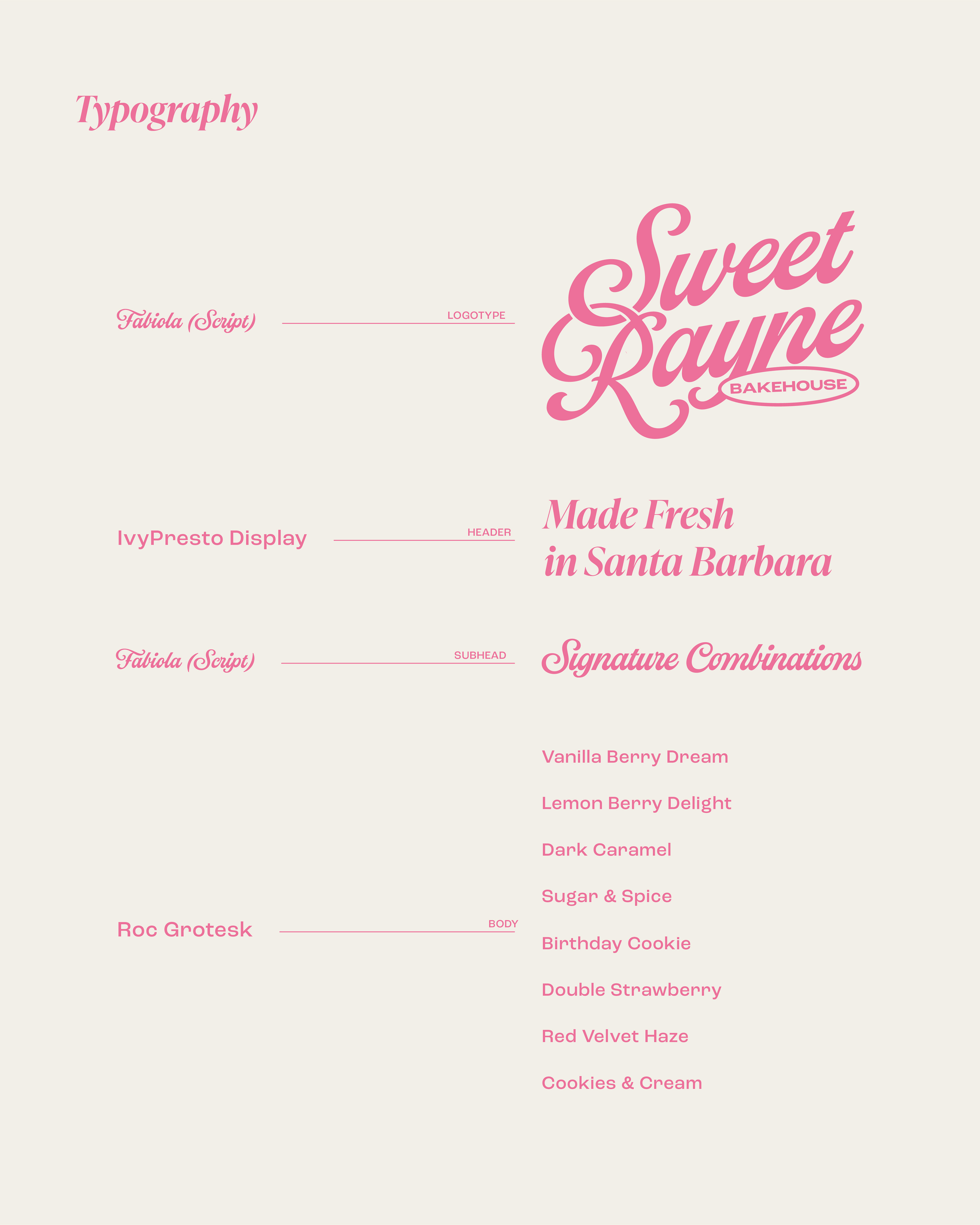
TYPOGRAPHY
The type suite is anchored by the script that is seen in the Logotype. An elegant, retro serif header pairs alongside the script with a simple san serif acting as the body type.