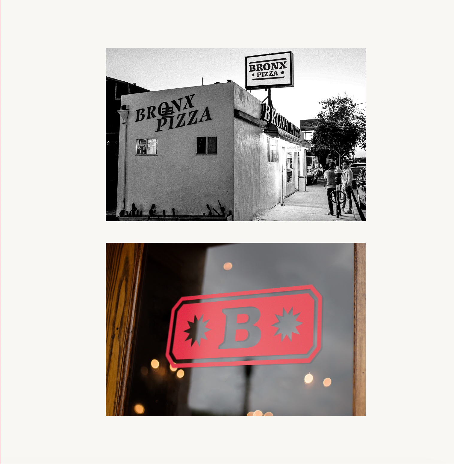

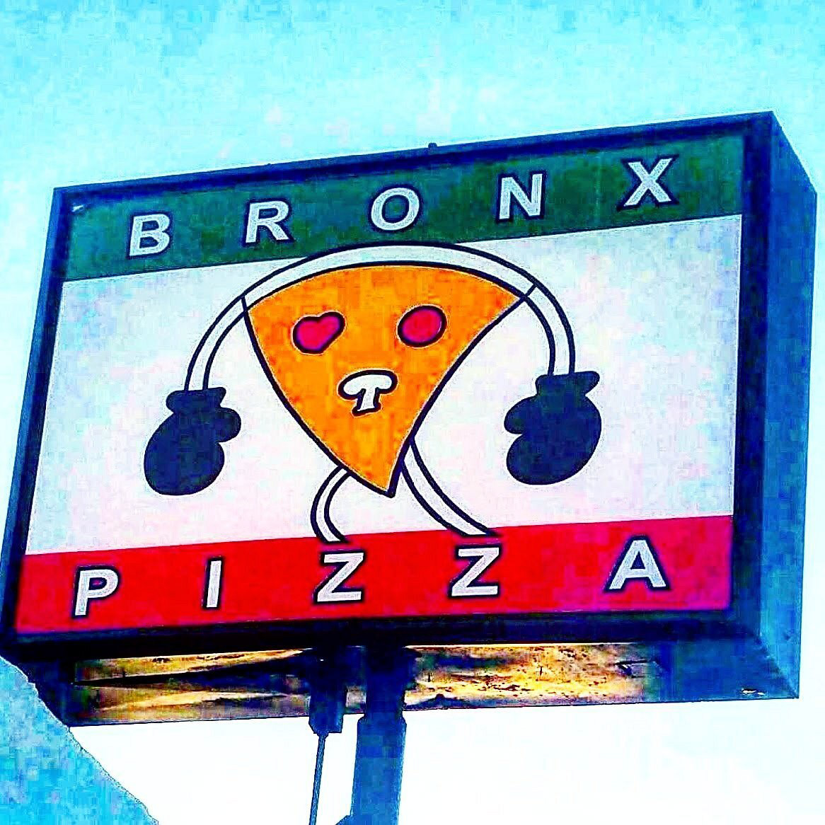
Current Logo
The current logo for Bronx Pizza leaves a lot to be desired. It doesn't scale very well, it lacks a consistent color palette, and it seems they don't have high image quality version at all. This leads to numerous inconsistencies in their brand. Their hard-nosed, grunge pizza place with New York and boxing influences and inspirations could result in a much more interest look.
The goal in this rebrand is to bring all of those elements together in a vintage, yet contemporary approach that pays homage to the city that built them.
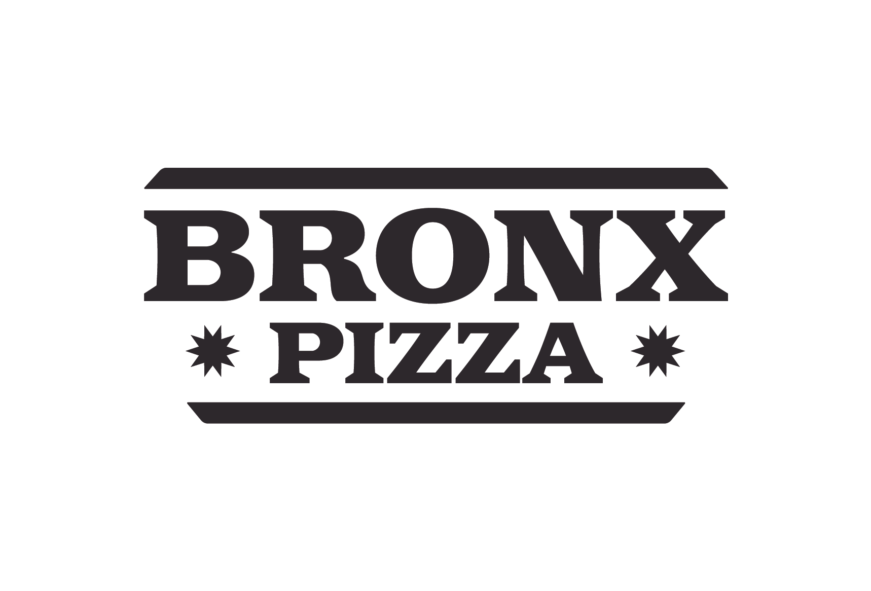
Proposed Logo
The proposed logo I created simplifies the look for Bronx Pizza. It keeps the rectangular and familiar shape while adding new elements such as the stars. The type face is a direct homage to their iconic sign on the side of the building, but in a more modernized approach. The one color approach helps the versatility of the logo as well since their current one has undergone numerous, random color variations.
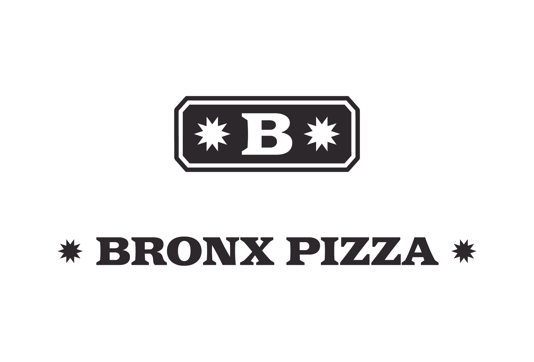
Secondary Logos
Another desired and needed element was secondary logos and a simple wordmark. Instead of forcing the main logo to scale down to a small size, the secondary logo can be used. The addition of the wordmark also allows for the branding to carry on throughout narrow spaces such as the sides of a pizza box.
Logos on Color
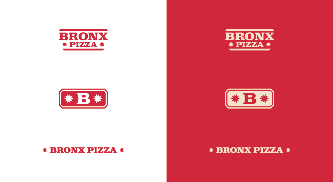
Logos on Black & White

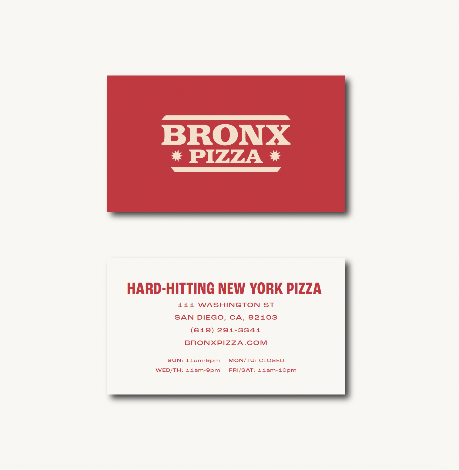
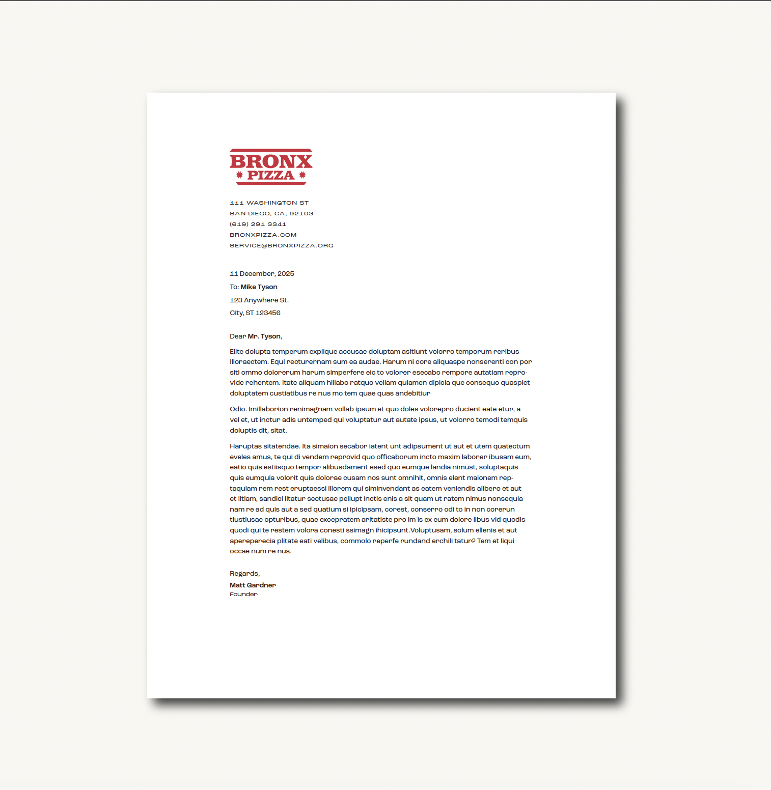
Stationery
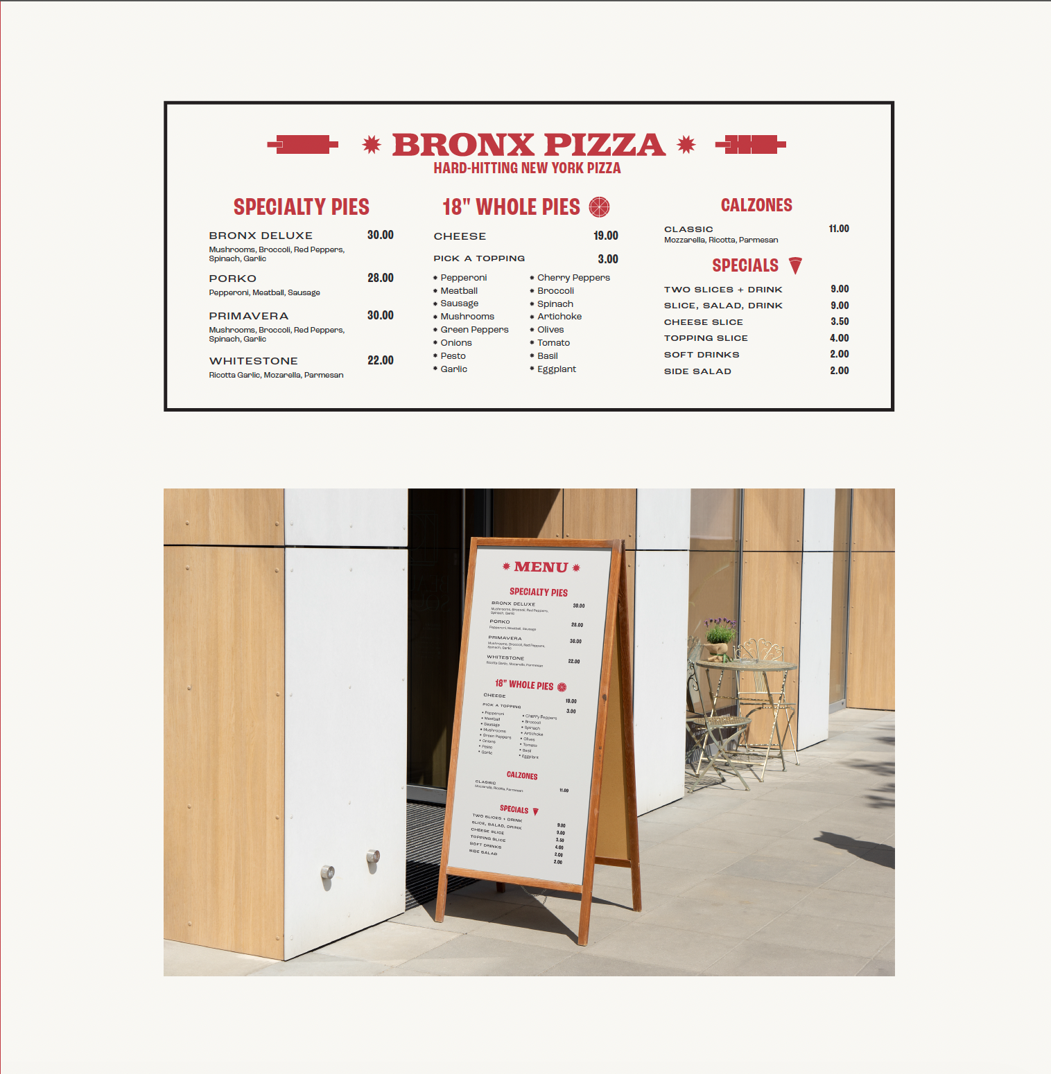
Storefront & Menu